Tuesday, April 12, 2011

My favorite artist!

Our family visited the Museum of Modern Art in New York years ago. The experience was quite overwhelming. I remember turning a corner, seeing the far wall covered with a large Van Gogh, and feeling like I had just been hit by a bus emotionally. I looked around to see if anyone else was feeling the same way and saw that my daughters and my wife had the same reaction. We were almost speechless.

Jackson Pollock did the same thing to us. His work towered over you and made you feel like you had never seen real art before. This was art that changed culture. Who would have ever expected that kind of visceral reaction to paint on a canvas? And I felt the same years later when we visited a modern art gallery in Paris.

Original art has that effect on you. It isn't just amusing or interesting; it grabs you by the heart and squeezes.

Art prints are a poor substitute. They fail to duplicate that unique artistic experience. In fact, they are so far away from that original experience that they are not really art at all but more like wallpaper. Blame Salvidor Dali for art prints. He dreamed the idea up so he could sell hundreds of copies of his work in order to finance his addiction to prostitutes and drugs. Look what he started. WalMart art.

I would suggest to anyone thinking about making even a minor investment in art that buying authentic works from a local artist is light years ahead of bringing home a printed copy. For two reasons. Quality art has an emotional impact that can't be duplicated. And you're supporting a local artist -not a printing company in China (yes, that's where the work is going.)

My daughter, Shanna, has been artistically gifted from the time she was a sprout. We always encouraged her art, as parents do, but as she got older we were careful to add that an art career was a very tough reality. Garrets and lofts and no-heat being the staple of the struggling painter. But she had a different idea. She believed she could find a way to do what she loved and still make a good living.

So true to her nature, instead of partying on weekends like most of her friends, she was at home or at the cottage painting canvases sometimes 12 hours a day, often seven days a week, learning new techniques and trying out new media. She painted countless canvases looking for just that right combination of image and impact before she began to make significant sales. Eventually she built a detailed web site (learning all the programming and graphic techniques on her own), began using Facebook and Twitter to promote her work as well as a number of other internet tools and sites.

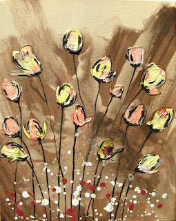
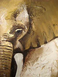
She was relentless. And slowly she began to build a global fan base of people who loved her work. (Examples of her artwork on this page: Tulips, Elephant Face, Mother Earth's Branches.) It is harder today to be a successful artists then ever - beside being skilled creatively you need social media skills, web building knowledge, delivery savvy, great communication to buyers, customer service skills and even packing knowledge. Shanna has all of these in spades. She absolutely deserves her success. Last year she sold over 300 original paintings to buyers all over the world. Her paintings hang in business offices, new homes, vacation retreats and professional boardrooms. A phenomenal accomplishment. She is currently in the top 5% of successful businesses on the sites she uses to promote her work online and she now mentors others in how to be successful.
Here is just a fraction of the feedback she has received.

"I love the paintings. The pictures do not do the paintings justice. They are beautiful ... especially in person. Thank you Shanna." March 1st, 2011

"The painting is amazing." Feb 3, 2011


"This is just beautiful ... we are quite excited to put this up in our new home as the center piece in our living room." Feb 1, 2011


"Absolutely perfect. This is one talented artist." Dec 18, 2010


Now to the point of this blog. As the proud father it really hurts to hear the comments she often gets from well-meaning friends that she is 'mass producing' art. Look up mass production on Wikipedia -"The production of large numbers of standardized parts ... on an assembly line." A pretty demeaning comment. Nothing could be a crueler dig to someone doing what they are passionate about. Or people who have made reference to the kind of kitsch art created in factories in Mexico where dozens of people crank out hundreds of copies of bad landscape art. Shanna creates original works, is very prolific, and puts enormous care and attention into every work. No two paintings are the same. In fact, she is constantly experimenting with new ideas, new subjects, new methods and media. I am amazed by her creativity and work ethic.


Shanna! I am very proud of what you are achieving through a a ton of hard work and creative thinking. Yes, I love you like crazy. That goes without saying. But I also respect your art. You have taught me a lot, way more than you ever learned from me when you were younger.

To learn more check out her work. Go to Etsy.com and search for Shannacreations.

Her Proud Dad.

Thursday, November 11, 2010

The 'Tree of Wonder' and Why!

The other day I checked Etsy, one of the Internet's most popular arts and crafts websites, using the search term 'tree'. Results? Over 40,000 objects of art related to or using images of trees.

So why do we all like trees so much?

There are expected answers of course. Nature is a beautiful thing and a tree is one of the worlds largest organisms. They create oxygen. Some scientists say they produce chemicals that make us feel good and enhance our immune system. And they look great summer, winter and fall.

But actually it's much more than that. When you take people and place them in an FMRI machine (neuroscientists call it 'going into the magnet') and show them images of trees, their brains light up far out of proportion with other nature images. Our brains are clearly highly aroused by tree imagery.

When you do a little more research you find that certain kinds of trees work better too. The tree shown in my painting "Tree of Wonder" is the tree type that test subjects find the most pleasing; a large lone spreading tree in the midst of a savanna or field. Very much like the kind of landscape you would expect to see in arid Africa, the birth place of humans. Protection from a storm or the noonday sun and a place to crawl up in the event of danger.

Sunday, November 15, 2009

Holly Smith's Lichtenstein- Pop Art Portrait

I saw Roy Lichtenstein's signature piece (a personal favorite), Whamm (1963) at the Tate Modern gallery in London in 2009. The painting is 5' 7" x 13' 4" (I love large paintings - it absolutely dominates the massive room it hangs in.)

I confess I was surprised by one characteristic of Lichtenstein's art - the close up detail is, well, a bit sloppy. Not as intentioned as I would like to see. By intentioned, I am referring to the characteristic of a line that is totally confident. You can see this in the stoke of a pen or brush where the line starts with a clear intention, follows through with purpose and confidence and ends boldly.

I first saw the beauty of this in the lines delineated by a professional sign painter. He had painted thousands of 'A's in his career and the sweep and speed of his work was mesmerizing. The lines he created were so unique, so powerful.


I tried to accomplish this intentionality with Holly's portrait (my daughter). The lines in her hair for example are classic thick/thin inspired from ink drawings and comic art. The minimalism and the contrasts are pure Pop art as are the primary colors used.

By the way, I show here the Wha
mm panel as well as the original comic book panel from All-American Men of War #89, 1962 (DC Comics) that Lichenstein used.

Randy Bachman, Canada's Rock n' Roll Hall of Fame!

Back in high school in the 60's, Randy Bachman used to skip high school classes to play guitar with the yet unknown Lenny Breau. Many years later, Lenny's son Chet had his first exposure to guitar (believe it or not) through my brother Tim, who is clearly the most talented guitar player in our family.

Since I can't do it through music, I chose to pay homage to Randy Bachman through pop art - after all, he is a Canadian superhero and deserves his own splash page.

First with the Guess Who, who became one of the biggest selling groups in the world and then BTO, Randy penned dozens of classic rock songs and memorable lead riffs, including Taking Care of Business to American Woman.

This painting on a 24" x 36" gallery wrapped canvas was commissioned for the Sapphire Technologies Charity Auction in November of 2009. The painting is signed by the artist as well as Randy himself.

Sunday, January 18, 2009

Optical And Other Illusions!

Imagine if suddenly the image on your computer monitor started to spin around out of your control; the screen becoming a maddening blur, words impossible to read. (Makes me a little seasick just thinking about it.) What would you do?

Most people would guess their system had been infected by some nasty new computer virus. Or their video card had given up the ghost. In no case would they think this was normal everyday computer behaviour and just ignore it.

But when our own computer system, in other words, our brain, goes into a similiar tail spin, we completely ignore the illusion and go on as if nothing has happened?

Most of us know this experience as a child. We spin around a few times, eyes closed, then drop to the grass. When we open our eyes and look up at the sky and trees, they are no longer rooted to the spot, the way we have always known them to be. They are now flying around us in a stomach lurching blur. The whole universe is spinning madly out of control – trees, building, clouds, everything.

We know this is wrong. Inaccurate. A gross delusion of some kind. So then why don’t we have ourselves checked in? Why do we just accept this new view of the universe so casually?


Researchers tell us we are born with a very powerful 'baloney generator' built right into our brain. It essentially runs 24/7. Rationalizes our odd behaviour. Makes excuses to protect our fragile egos. And fills in the blanks when information is missing. And that leads us to the reasons why optical illusions are so interesting and can be used by artists to make a statement.

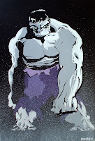
The painting shown here, Hulk In The Fog #1 is an example of what I think is a fairly effective optical illusion. Because our visual cortex is used to processing blur, dust and smoke as a distance effect, whenever we see these visual clues we assume they are representative of the background. Using a simple splatter effect on most of the monster pushes him back into the distance. But notice the arm and hand, clearly outlined, seems to push into the foreground with much more emphasis than one would expect based on the information we have.

Our brain doesn't see the splatter as dots on the page. Instead an optical illusion of distance is created.

Painting shown is Hulk In The Fog #1 by Russ Smith, 24" x 36" January 2009, after Tim Sale's drawing of the Grey Hulk. To enlarge the image, please click on the painting.

Thursday, January 15, 2009

50 Year Old Printing Technology Celebrated!

This posting was supposed to be about Jack 'King' Kirby, who along with Stan Lee, invented the modern angst-filled superhero. Having just finished "Tales To Astonish", the story of the rise of Marvel comics, I am filled with awe for the sheer output of the man. He produced more artwork in his career than any another ten illustrators - over 10,000 pages. The hours he spent at a drafting table alone would make him a legend. Even if he was average. But Jack was far from average. (Above is one my paintings, one of several tributes to Jack's best invention, Captain America.)

Two comments then. First, he must have received immeasurable satisfaction from the work he did. What else would drive a person to spend 12-14 hours a day for decades perfecting his craft. Despite the low pay, the theft of his intellectual capital and the lousy managment he faced - he perservered. And you can see the passion in his work. There was nothing else he wanted to do with his life. How many people can say that?

Second. How much better would we be at our jobs or hobbies if we spent 10 lifetimes perfecting our craft? That's what Kirby essentially did. He started out with talent, within only a few years was recognized as tops in his field, but he didn't stop there. He took on more work than anyone else in the industry, worked under as many as four different pen names and worked in a variety of styles and genres.

The arc of Jack's career was truly unique. So much so that he created a new shorthand for graphic illustration, pushed envelopes in every direcion, built universes of characters that may well live forever.

But like I said, this posting wasn't supposed to be about that. It was supposed to be about registration.

Registration? Coincidentally, the cover for a recent Kirby prespective used a typical comic lettering style (the KIRBY above) with mis-registered coloring. Anyone who is interested in Golden Age comics is familiar with this problem. It must have driven artists crazy - to see their hard work messed up by a hurried colorist. But it is so much a part of the experience, too. Immediately that look communicates old comics, yellowing newsprint and raw artwork.


That's why in this painting of The Spirit, I intentionally 'mis-registered' the color on a part of his sleeve. It came so naturally to me I hardly noticed until I was finished, I was paying homage to 50 year old printing and coloring techniques.

(Shown on this page: Brave & Bold #1 in Acrylic on canvas, and The Spirit on canvas and Captain America #1 on masonite. If the titles sound like comic books, nuff said. To see a larger image, just click on the graphic.)

Wednesday, January 14, 2009

Pollock and Romita United!

The original look and feel for Spiderman was created by the iconic penciller and inker Steve Ditko back in the 60's.

The artist who made Spiderman truly a heroic figure though was Johnny Romita. He 'super-sized' Ditko's creation, fleshed him out, made him feel more substantial, more masssive and powerful. (No question - I'm going to get email now from the Ditko fans).


While working on a sketch for the Spiderman canvas above, I was struck by some of the limitations of comic art structure. You know, the hard ink line, the flat colors. Yes, there is a boldness about the color and shape of a typical superhero image that transcended the character. The hard black 'gesture-like' outlines light up my brain and the reds and blues boost the reaction. But I wanted more.

So I took a basic image of Spiderman and began playing with different settings for the background. And as soon as I added abstract paint backgrounds, I knew I had what I wanted.

This 'idea sketch' is based on using Jackson Pollock's "Number 8" (1949) painting as a background with Spidey up front. Yes, Photoshop is as important a tool as a good sable brush.


My apologies to both Tim Sale (who inked this version of Spiderman) and Pollock's estate. This was only an exercise in mashing genres and images.

(Painting shown here is Spiderman Abstract #1 2008 24" x 36" by Russ Smith. For a larger image, please click on the graphic.)

Monday, January 12, 2009

Edge Detection Software and Dopamine!

Your brain is the result of millions of years of natural selective breeding. (Well, maybe not that selective. Have you met my brother-in-law?)

Brains that recognized edges survived to raise babies. Brains that didn't recognize edges fell out of the tree or tumbled over cliff faces and sadly had fewer chances to reproduce. So after thousands of generations, our brains have become quite good at defining shapes, evaluating distance and getting a buzz from recognizing high definition edges. Blacks. Blues. Hot reds. Shimmering whites. Yahoo!

Our love for these images; for high contrast negative and positive spaces (think 'Sin City'), for illusions of depth, for contrasting color - are buried deep in our central processing system, in our visual cortex. When we see a flat representation of reality (example, the 'Under The Snow' painting above), our brain adds a lot of processing power to the image to get the definition improved, add depth and seek out context.

In the process, our visual processing system hits those black spaces and hard edges and our brains light up. (OK! Not everyone gets the same buzz to the same degree, but if you do, you know what I mean.) That buzz is dopamine. A chemical very similar to cocaine. But it's natural and free - and we never get tired of the effect.

Poplar trees in the snow are a rich field for edge junkies. The painting in progress above is only one of several I am currently experimenting with, inspired by photos like this one, taken in late December at Birds Hill Park in Manitoba.

Gives your edge detection software a real workout.

Painting shown is by the author, Underneath The Snow #1, 24" x 36", Feb 2009. For a larger view, please click on the image. To purchase artwork, please send email.

Sequential Art Anyone?

Google 'sequential art' and the first result you will get is the Wikipedia entry for 'comics'. Sequential art is a series of images driving a narrative.

I think my attraction to comic book imagery (oops, I meant 'graphic novel' art) has as much to do with the lure of the sequential frames as the bold lines, striking blacks and primary colors. I still get a buzz from the single images, but there is no question that a great 'page' has it's own attraction. There is definitely a cinematic quality to the way great pages flow from frame to frame. Jack Kirby, the greatest graphic novel artist of them a all, often mntioned movies as his biggest influence - and you can see that in his dynamic splash panels.

The canvas I am working on here was selected from several issues of Hell Boy, drawn by Mike Mignola. Mike doesn't really play around much with line thickness, which is pretty unusual in the post-Kirby world of bold pop imagery. But I didn't really notice this until I started painting a page of his art onto canvas.

But Mike really understands how to use
black and white space - and his panels are artwork in their own right. (Acrylic painting shown is "Run Like Hell" 2009 24" x 36". To see an enlarged version, click on the graphic.)

Monday, November 24, 2008

When The Medium Is the Message (Honest!)

This famous quotation , 'the medium is the message', comes from world-renowned Canadian writer and thinker, Marshall Mcluhan. But what does it really mean? Do I really want to go there?

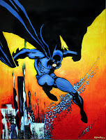
Here's my take on this. Let's say I paint an image of Batman on canvas. (Just because I enjoy playing with these powerful pop images.) And as I'm painting a particular line on the canvas in acrylic, I realize I am duplicating a line originally rendered in India ink on paper, a technique used in comic book production in the Golden and Silver age. And this style of ink line (thick and thin) evolved out of neccessity - after all a line had to be thick enough to render on cheap newsprint after being reduced - and not get buried in the colored ink - but not be too thin so as to be lost or lose their impact on readers.

So the ultimate images we remember from the comics of the 60's and 70's actually grew out of the medium itself as much as the imaginations of the artists. Cheap newsprint printed in a given size (for economic reasons) pushed creative boundries and became the mother of invention. So the image I am painting then is not as much the "message" asis the medium of comic books which made neccessary a certain kind of line style, a certain way or working in ink and a particular way of generating blocky primary color fields.


Often the medium rules. Try using a a fine tipped ink pen on a cave wall and that will give you some idea of how this works in real life.

(Painting shown is by the author, Batman In The Abstract #2, 24" x 36" 2008) For an enlarged view, click on the image.