Sunday, January 18, 2009

Optical And Other Illusions!

Imagine if suddenly the image on your computer monitor started to spin around out of your control; the screen becoming a maddening blur, words impossible to read. (Makes me a little seasick just thinking about it.) What would you do?

Most people would guess their system had been infected by some nasty new computer virus. Or their video card had given up the ghost. In no case would they think this was normal everyday computer behaviour and just ignore it.

But when our own computer system, in other words, our brain, goes into a similiar tail spin, we completely ignore the illusion and go on as if nothing has happened?

Most of us know this experience as a child. We spin around a few times, eyes closed, then drop to the grass. When we open our eyes and look up at the sky and trees, they are no longer rooted to the spot, the way we have always known them to be. They are now flying around us in a stomach lurching blur. The whole universe is spinning madly out of control – trees, building, clouds, everything.

We know this is wrong. Inaccurate. A gross delusion of some kind. So then why don’t we have ourselves checked in? Why do we just accept this new view of the universe so casually?


Researchers tell us we are born with a very powerful 'baloney generator' built right into our brain. It essentially runs 24/7. Rationalizes our odd behaviour. Makes excuses to protect our fragile egos. And fills in the blanks when information is missing. And that leads us to the reasons why optical illusions are so interesting and can be used by artists to make a statement.

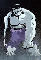
The painting shown here, Hulk In The Fog #1 is an example of what I think is a fairly effective optical illusion. Because our visual cortex is used to processing blur, dust and smoke as a distance effect, whenever we see these visual clues we assume they are representative of the background. Using a simple splatter effect on most of the monster pushes him back into the distance. But notice the arm and hand, clearly outlined, seems to push into the foreground with much more emphasis than one would expect based on the information we have.

Our brain doesn't see the splatter as dots on the page. Instead an optical illusion of distance is created.

Painting shown is Hulk In The Fog #1 by Russ Smith, 24" x 36" January 2009, after Tim Sale's drawing of the Grey Hulk. To enlarge the image, please click on the painting.

Thursday, January 15, 2009

50 Year Old Printing Technology Celebrated!

This posting was supposed to be about Jack 'King' Kirby, who along with Stan Lee, invented the modern angst-filled superhero. Having just finished "Tales To Astonish", the story of the rise of Marvel comics, I am filled with awe for the sheer output of the man. He produced more artwork in his career than any another ten illustrators - over 10,000 pages. The hours he spent at a drafting table alone would make him a legend. Even if he was average. But Jack was far from average. (Above is one my paintings, one of several tributes to Jack's best invention, Captain America.)

Two comments then. First, he must have received immeasurable satisfaction from the work he did. What else would drive a person to spend 12-14 hours a day for decades perfecting his craft. Despite the low pay, the theft of his intellectual capital and the lousy managment he faced - he perservered. And you can see the passion in his work. There was nothing else he wanted to do with his life. How many people can say that?

Second. How much better would we be at our jobs or hobbies if we spent 10 lifetimes perfecting our craft? That's what Kirby essentially did. He started out with talent, within only a few years was recognized as tops in his field, but he didn't stop there. He took on more work than anyone else in the industry, worked under as many as four different pen names and worked in a variety of styles and genres.

The arc of Jack's career was truly unique. So much so that he created a new shorthand for graphic illustration, pushed envelopes in every direcion, built universes of characters that may well live forever.

But like I said, this posting wasn't supposed to be about that. It was supposed to be about registration.

Registration? Coincidentally, the cover for a recent Kirby prespective used a typical comic lettering style (the KIRBY above) with mis-registered coloring. Anyone who is interested in Golden Age comics is familiar with this problem. It must have driven artists crazy - to see their hard work messed up by a hurried colorist. But it is so much a part of the experience, too. Immediately that look communicates old comics, yellowing newsprint and raw artwork.


That's why in this painting of The Spirit, I intentionally 'mis-registered' the color on a part of his sleeve. It came so naturally to me I hardly noticed until I was finished, I was paying homage to 50 year old printing and coloring techniques.

(Shown on this page: Brave & Bold #1 in Acrylic on canvas, and The Spirit on canvas and Captain America #1 on masonite. If the titles sound like comic books, nuff said. To see a larger image, just click on the graphic.)

Wednesday, January 14, 2009

Pollock and Romita United!

The original look and feel for Spiderman was created by the iconic penciller and inker Steve Ditko back in the 60's.

The artist who made Spiderman truly a heroic figure though was Johnny Romita. He 'super-sized' Ditko's creation, fleshed him out, made him feel more substantial, more masssive and powerful. (No question - I'm going to get email now from the Ditko fans).


While working on a sketch for the Spiderman canvas above, I was struck by some of the limitations of comic art structure. You know, the hard ink line, the flat colors. Yes, there is a boldness about the color and shape of a typical superhero image that transcended the character. The hard black 'gesture-like' outlines light up my brain and the reds and blues boost the reaction. But I wanted more.

So I took a basic image of Spiderman and began playing with different settings for the background. And as soon as I added abstract paint backgrounds, I knew I had what I wanted.

This 'idea sketch' is based on using Jackson Pollock's "Number 8" (1949) painting as a background with Spidey up front. Yes, Photoshop is as important a tool as a good sable brush.


My apologies to both Tim Sale (who inked this version of Spiderman) and Pollock's estate. This was only an exercise in mashing genres and images.

(Painting shown here is Spiderman Abstract #1 2008 24" x 36" by Russ Smith. For a larger image, please click on the graphic.)

Monday, January 12, 2009

Edge Detection Software and Dopamine!

Your brain is the result of millions of years of natural selective breeding. (Well, maybe not that selective. Have you met my brother-in-law?)

Brains that recognized edges survived to raise babies. Brains that didn't recognize edges fell out of the tree or tumbled over cliff faces and sadly had fewer chances to reproduce. So after thousands of generations, our brains have become quite good at defining shapes, evaluating distance and getting a buzz from recognizing high definition edges. Blacks. Blues. Hot reds. Shimmering whites. Yahoo!

Our love for these images; for high contrast negative and positive spaces (think 'Sin City'), for illusions of depth, for contrasting color - are buried deep in our central processing system, in our visual cortex. When we see a flat representation of reality (example, the 'Under The Snow' painting above), our brain adds a lot of processing power to the image to get the definition improved, add depth and seek out context.

In the process, our visual processing system hits those black spaces and hard edges and our brains light up. (OK! Not everyone gets the same buzz to the same degree, but if you do, you know what I mean.) That buzz is dopamine. A chemical very similar to cocaine. But it's natural and free - and we never get tired of the effect.

Poplar trees in the snow are a rich field for edge junkies. The painting in progress above is only one of several I am currently experimenting with, inspired by photos like this one, taken in late December at Birds Hill Park in Manitoba.

Gives your edge detection software a real workout.

Painting shown is by the author, Underneath The Snow #1, 24" x 36", Feb 2009. For a larger view, please click on the image. To purchase artwork, please send email.

Sequential Art Anyone?

Google 'sequential art' and the first result you will get is the Wikipedia entry for 'comics'. Sequential art is a series of images driving a narrative.

I think my attraction to comic book imagery (oops, I meant 'graphic novel' art) has as much to do with the lure of the sequential frames as the bold lines, striking blacks and primary colors. I still get a buzz from the single images, but there is no question that a great 'page' has it's own attraction. There is definitely a cinematic quality to the way great pages flow from frame to frame. Jack Kirby, the greatest graphic novel artist of them a all, often mntioned movies as his biggest influence - and you can see that in his dynamic splash panels.

The canvas I am working on here was selected from several issues of Hell Boy, drawn by Mike Mignola. Mike doesn't really play around much with line thickness, which is pretty unusual in the post-Kirby world of bold pop imagery. But I didn't really notice this until I started painting a page of his art onto canvas.

But Mike really understands how to use
black and white space - and his panels are artwork in their own right. (Acrylic painting shown is "Run Like Hell" 2009 24" x 36". To see an enlarged version, click on the graphic.)